Brand Resources

Applications

Applying the Tarter brand system correctly across all mediums isn’t just suggested, it’s a steadfast rule. These brand tools are an important part of the public, customer, and employee experience, so creating a consistent look for each viewing –  in person, online, or print – plays a large role in gaining a viewer’s trust.

Brandmark Uses

Proper

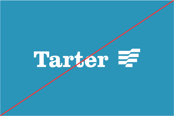
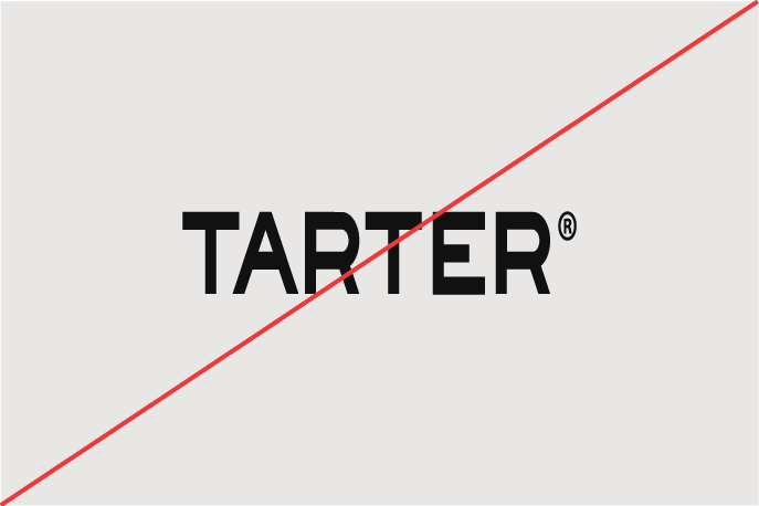
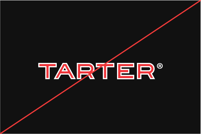
Brand logos and marks must be presented in approved color, ratio, dimensions, and arrangements at all times. No versions of the icon and logotype can be altered or edited for specific events, holidays, or promotions.

It is vital to choose appropriate backgrounds on which to place the logo marks. Icons, logo marks, and sub-brand graphics must be placed suitability on color backgrounds within the brand palette or images that offer proper contrast and are evaluated for appropriateness. This will ensure the marks are consistent when viewed across platforms and offer the best readability.

Brandmark Uses

Improper

When there is a correct way, there must be an incorrect way. These examples provide a visual guide to identifying some of the more common misuses of brand including improper color usage, icon manipulation, icon placement, and more. Look out for these mistakes when applying brand to any application.

HINT: If you must introduce unapproved effects like outlines or drop shadows in order to gain readability. An appropriate background will allow the icon to stand on its own.

Do not place brand marks over static (non-video) backgrounds that do not provide proper contrast.

Do not violate clear space requirements and place marks too close to competitive objects and images.

Improper Use - Tagline

Do not attach unapproved sub lines, statements, or graphics to the main brand marks for alternate versions.

Improper Use - Font Change

Only use approved Tarter word mark as the core brand graphic in all applications. The word mark is a custom-built graphic and not a font, making the need for re-setting the text at any time unnecessary.

Improper Use - Stretched

Do not scale brand marks out of proper ratio.

Improper Use - Stroke

Do not add strokes or alter brand mark approved colors.

Improper Use - Contrast

Do not place brand marks on backgrounds or flat colors that impact readability and contrast.

Improper Use - Tilted

Do not rotate brand marks in any scenario.

Print Uses

Print applications of the Tarter brand are diverse across many retailers and product needs. It is vital not only that our brandmarks are used correctly but also typography, color, textures, and images all be used consistently. 

Apparel and Merchandise Uses

For the identity system to stay recognizable and legible, brand marks have a set size for merchandise and apparel. The following sizing and placement standards are set to ensure consistency of brand presentation regardless of material or use. The sizing specification of the marks are not recommendations, but rules that must be followed for professional and tasteful corporate and retail uses.

Color choices in apparel are highly recommended to stay in neutral tones and utilize brand colors as much as possible. Materials that are PMS match the primary Tarter Pantone color (Bluegrass), as well as black, charcoal, and white, are preferred choices. They offer the best opportunity for high contrast of brand marks and consistency with other branded applications.