Brand Resources

Brand Elements

The Tarter brand has a variety of design elements that can be used as an accent to the core brand marks and images within print and digital applications. Secondary marks and elements like these are not mandatory; however help build visual consistency across platforms and complete brand narratives.

What is a brand element?

Brand elements are supporting graphics that can be used to either tell further aspects of the brand narrative, or accent information to break up standard layout images and graphics. These graphics typically have specific use cases, so refer to the information below on how they may come into play.

American Made Stamp

The made in USA badge is an element that can be used in many narrative, sales, and general (non-product specific) promotional pieces. The application of this mark is intended to be a supporting element and not the sole graphic representation of the Tarter branding in any manner. 

The clean version is intended for smaller applications where the textured version would lose its detail when scaled down. The textured version should be the primary use in the majority of applications.

Textured version
clean version
Textured version (reverse)
Clean version (reverse)
Clear Space Requirements & Minimum Size

Use the radius of the circle to determine the clear space requirements. Cut the circle in half and duplicate it around the edge to ensure there is enough negative space.

In order for the identity system to stay recognizable and legible, brand marks have a set minimum size for digital & print. It is essential to follow this rule to ensure the viewer can still read the marks and that they can print clearly.

Clean Minimum Size: Print 0.75” Wide, Digital 70 px Wide

Textured Minimum Size: Print 1.0” Wide, Digital 100 px Wide

Badge Padding

Icon Tag

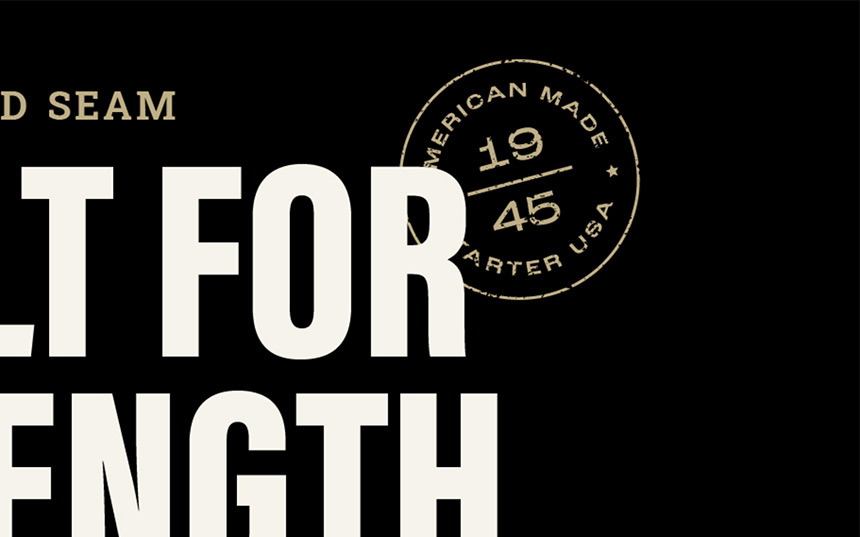
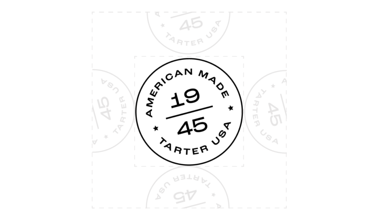
Use the logo on a “tag” element that is anchored to an edge. The medium where it’s placed must have a bleed, and the final placement should allow the logo to sit within a vertical rectangle. Only use the white logo on a black or bluegrass background and ensure there is appropriate contrast between the tag and what it’s placed on.

Note: The tag design and container size are intended primarily for print uses. Uses in video formats may vary.

Black Version
Bluegrass version

Dividers

The wave divider is derived from the top of one of the logo icon’s “stripes.” When using this element, make sure the line stays comparatively thin. Still, it can be duplicated to create a pattern or used as a decorative element to anchor typography above or below it.

Wave